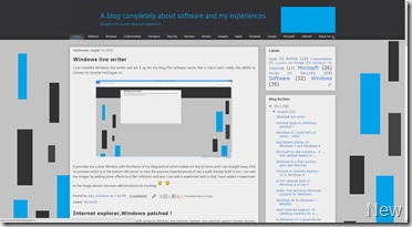
If you are a regular visitor to my blog then you might have noticed a big change in terms of design. I have made these changes hoping for a better and smoother experience in this blog.


The left side shows the old design and right side shows the current design. I have removed the orange effect from my blog and now it sports a minimalistic blue,black and grey color. The colors make my blog look clean and better for reader. I have taken some of my precious time designing it and each and everything is customized and made to look to simpler. I have created the background images and header image myself.You can also see similar changes in my friend’s blog Gadget Access which is also done by me using my friend’s choice of color (green).
Which one do you like the most ? I love hearing from my readers, if you have any suggestion then kindly comment it under the post.

No comments:
Post a Comment